An invitation sets a tone before a single guest arrives. When that invitation is in Arabic, the design decisions go deeper than font choice — the entire visual logic of the page runs in the opposite direction, and ignoring that produces something that feels off even to guests who can't quite say why.
Why RTL Rewrites the Whole Layout
Right-to-left text isn't simply left-to-right text with the words flipped. The reading gravity of the page changes. A reader's eye enters from the right margin, so the most important element — a couple's names, an event title, a host's greeting — belongs on the right side of the composition, not the left. Hierarchy flows rightward, then downward.
This affects every structural decision: where a decorative border feels anchored, which corner holds the date block, how a two-column layout is ordered. A design built on a standard left-aligned template and then switched to Arabic text will feel visually unbalanced, because the weight of the text pulls against the weight of the layout.
Practically, this means starting from an RTL-native canvas rather than adapting a Western one. If you're using Venito's invitation editor, selecting an RTL layout from the outset flips the entire grid — text alignment, element positioning, and reading flow — so you're not fighting the template at every step.
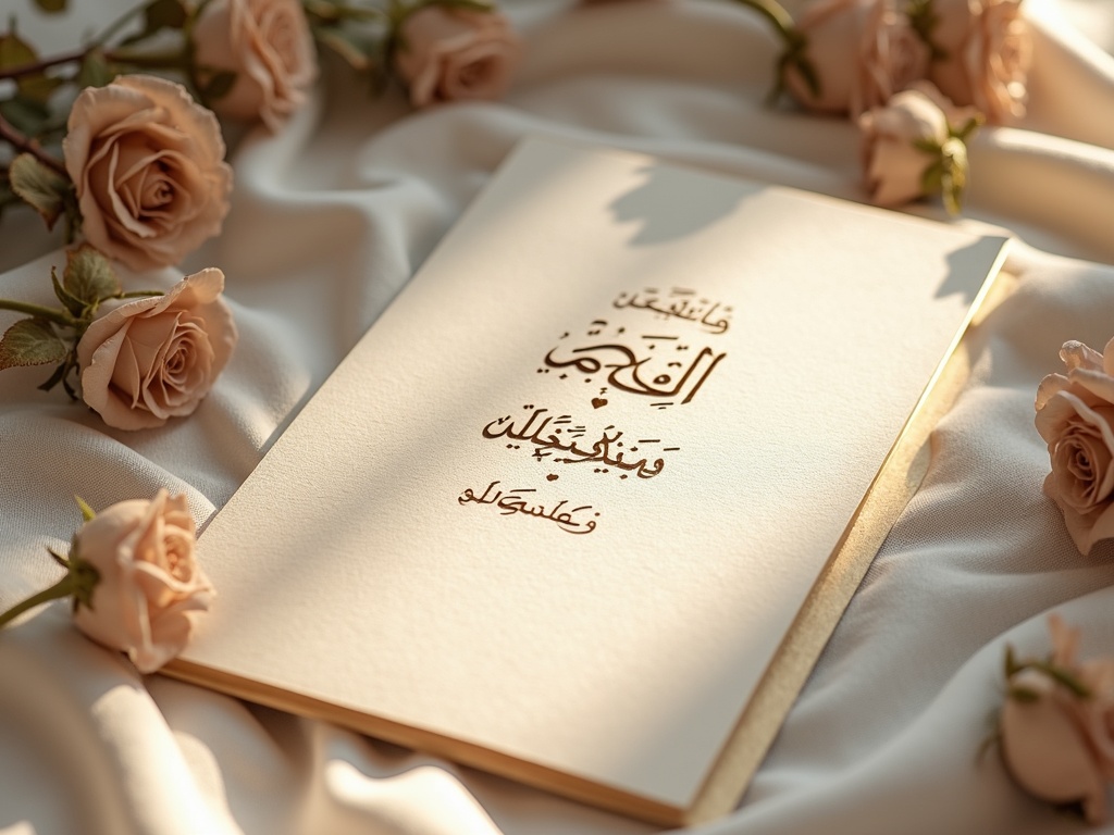
Calligraphy or Contemporary Type?
Traditional Arabic calligraphy invitation design draws on scripts like Naskh, Thuluth, and Diwani — each with its own personality. Thuluth is ceremonial and dense, often seen on mosque inscriptions and formal wedding pieces. Naskh is cleaner and more legible at smaller sizes. Diwani is fluid and romantic, with letters that interlock in elaborate ligatures.
For an arabic calligraphy invitation, the script choice should match the event's register. A formal Riyadh wedding might call for Thuluth in gold on ivory card. A Cairo birthday dinner could carry Naskh in a deep navy. A modern Dubai engagement party might use a contemporary geometric Arabic typeface — something like Almarai or Tajawal — which reads beautifully on screen and prints cleanly at small sizes.
The mistake is treating calligraphy as decoration rather than content. If the calligraphic header is illegible to half your guests, it becomes wallpaper. Legibility is respect.
Numbers, Dates, and the Numeral Question
This is where many otherwise careful designs stumble. Arabic uses two numeral systems: Western Arabic (0, 1, 2, 3 — the digits used globally) and Eastern Arabic (٠, ١, ٢, ٣ — standard in Egypt, the Gulf, and the Levant for formal text). Which you use is not just a style call; it signals cultural register and geographic context.
For a wedding in Beirut or Cairo, Eastern Arabic numerals in the date block feel native and considered. For an invitation going to a mixed international guest list — say, a London celebration for a British-Lebanese family — Western Arabic numerals are often the safer choice for clarity, even if the body text is fully in Arabic.
Dates also carry a structural question: the Hijri calendar is still used for formal religious occasions in many communities, while the Gregorian date is needed for practical logistics. Many hosts include both, formatted as: ١٥ رجب ١٤٤٦ هـ / 14 January 2025. The dual date is a courtesy, not a compromise.
Time notation follows the same logic. 8:00 مساءً (8:00 PM) is unambiguous in Arabic. Don't assume a 24-hour clock solves the problem — it can feel clinical on a wedding invitation.
Pairing Arabic with Latin Scripts
Bilingual invitations are common, and the pairing of Arabic with English, French, or another Latin script introduces a new set of decisions. The two scripts should feel like they belong together, not like one was added as an afterthought.
Type pairing works best when the two fonts share a similar optical weight and x-height. A heavy, ornate Arabic display font sitting next to a thin, spindly Latin serif will look mismatched. Fonts designed as Arabic-Latin pairs — such as Lateef with a humanist serif, or Scheherazade New alongside a transitional Roman — are worth seeking out specifically for this reason.
For an arabic wedding invite with both scripts, consider giving each language its own section of the card rather than interleaving line by line. A clean horizontal rule or a strip of geometric ornament can divide the two halves without making the bilingual structure feel awkward. The Arabic half reads right-to-left from the top; the English half reads left-to-right below it. Each script gets to breathe.
Common Pitfalls — and Quick Fixes
Even experienced designers make predictable errors on RTL invitation work. Here are the ones that appear most often:
- **Punctuation placement**: In Arabic, punctuation marks like the comma (،) and question mark (؟) are mirrored versions of their Latin equivalents. Using standard Latin punctuation inside Arabic text is a small error that signals the text wasn't proofread by a native reader.
- **Justified text gone wrong**: Full justification in Arabic can produce rivers of white space between words, especially at narrow column widths. Right-aligned text, rather than justified, is almost always cleaner on an invitation.
- **Diacritics omitted on formal text**: Short vowel marks (tashkeel) are optional in everyday Arabic but expected on formal ceremonial text. Omitting them on a Quranic verse or a traditional blessing looks incomplete.
- **Mixing font styles mid-word**: Arabic letters connect, and switching fonts mid-phrase breaks those connections. Keep a single typeface for each language block.
- **Ignoring the digital RTL context**: On a digital rtl invitation, HTML and CSS need explicit direction attributes (dir="rtl") to render correctly. A design that looks right in a PDF can reflow incorrectly in an email client if the underlying markup doesn't declare the text direction.
The fix for most of these is the same: have a fluent Arabic reader review the final design before it goes out — not just the translation, but the layout, punctuation, and typographic choices. A five-minute review catches errors that would otherwise reach three hundred guests.
Getting arabic invitation design right is partly technical and partly cultural. The technical part — RTL grids, numeral systems, font pairing — can be learned and systematised. The cultural part requires genuine attention to the community you're designing for, because the same script carries different expectations in Casablanca, Amman, and Abu Dhabi. The hosts who get it right are the ones who treat both halves as equally important.